.webp)
Hindou Forum of Belgium
(2025)
Ancient roots. One voice. Unstoppable future.
More details
Branding
CLIENT
The Hindu Forum of Belgium is the official representative body of Hindu communities across Belgium. Founded in 2007, it serves as a bridge between Hindu organisations, public institutions, and wider society promoting dialogue, recognition, and social cohesion. At its core, the Forum stands for unity in diversity: honouring Hindu heritage while fostering mutual respect among all faiths.
ASSIGNMENT
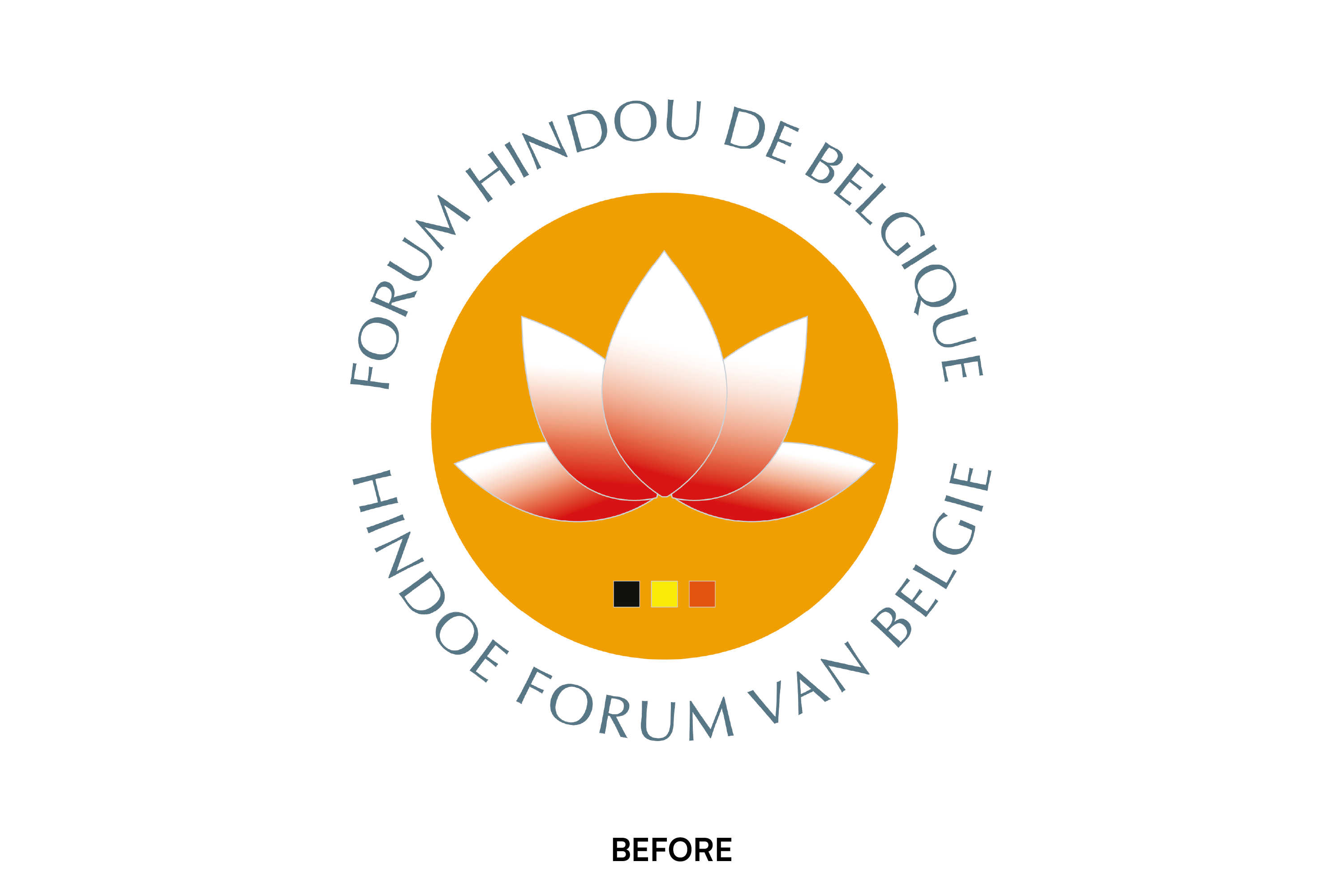
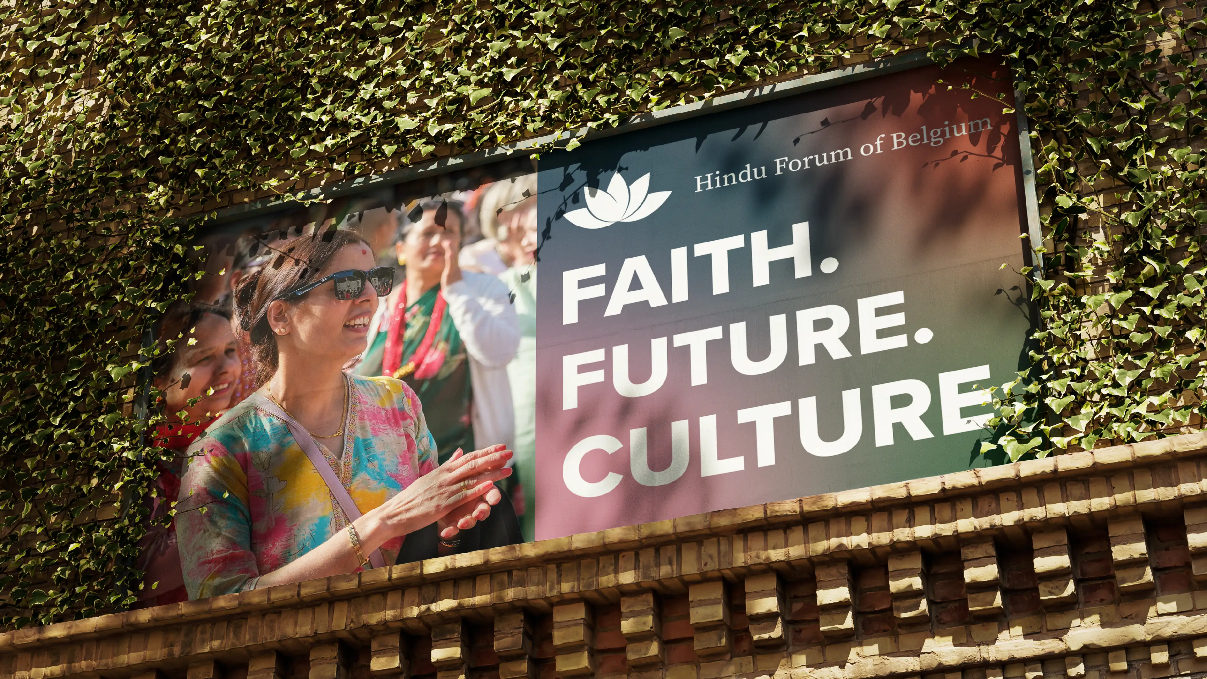
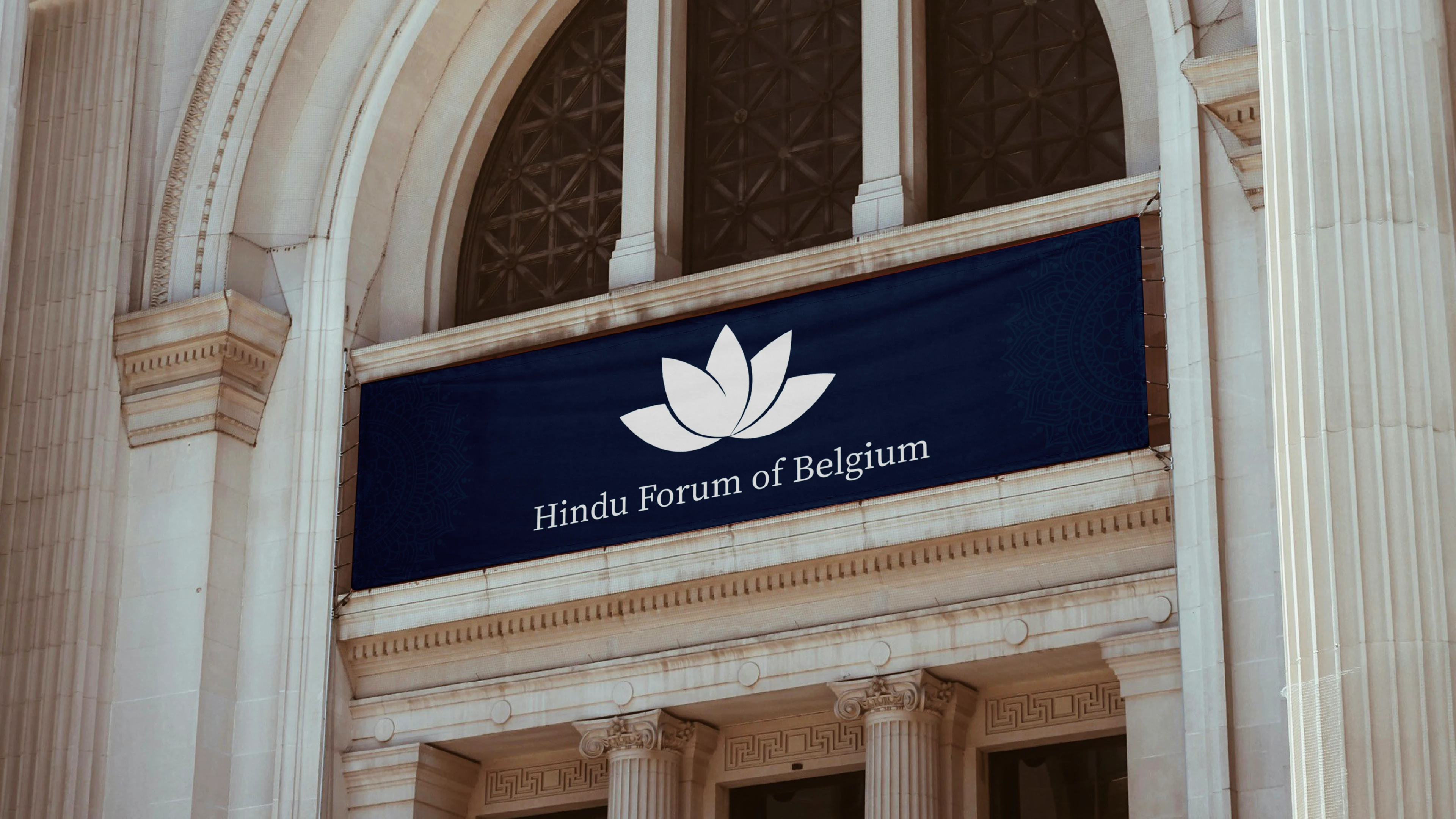
The original logo felt dated and visually heavy: gradients, bright colours, and a crowded composition reduced clarity and authority. My task was to modernise the identity while preserving the lotus concept. The goal was to create a cleaner, stronger visual system redefining colours, typography, and overall communication to better represent an inclusive and contemporary organisation.
CREATIVE PROCESS
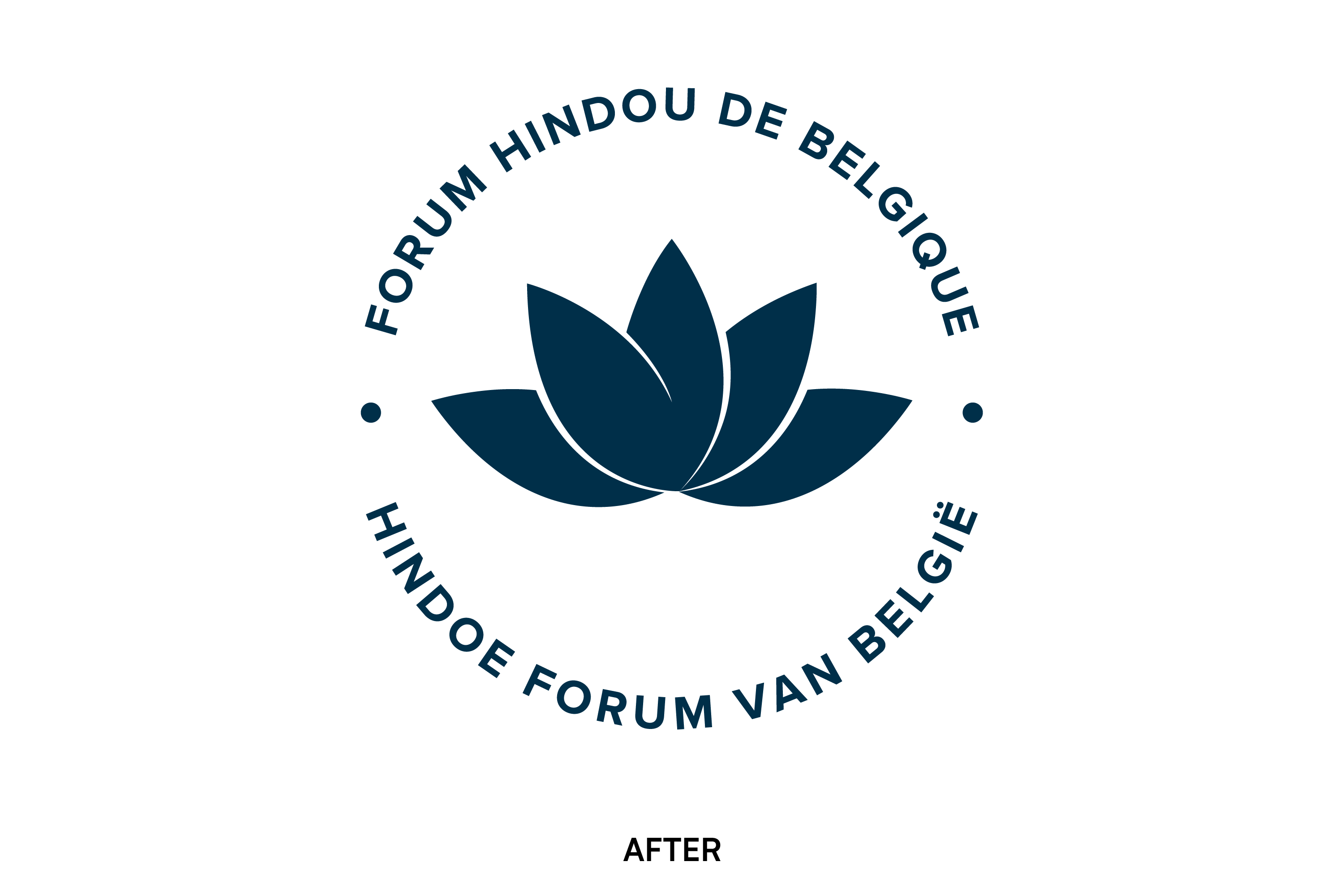
I simplified the lotus into a sharper, more balanced symbol, removing gradients and unnecessary elements. The bright circular badge was eliminated to give the logo space and flexibility. A refined, deep monochromatic palette replaced the previous saturated colours, giving the brand dignity and consistency. The typography was redesigned to feel modern and harmonious in both French and Dutch. The result is a confident identity: rooted in tradition, but clearly positioned in the present.
.webp)
.webp)
.webp)
.webp)
RELATED PROJECTS